



OVERVIEW*
The PROBLEM
Deep24 was functionally robust but lacked a cohesive visual or interaction system. The interface was crowded and inconsistent, with redundant features, unclear hierarchy, and competing visual signals that made core actions difficult to interpret. As the product expanded, it required a unifying visual language and clearer UX structure.
The OUTCOME
I established a cohesive visual system, restructured core UX flows, and designed new features that enabled Deep24 to scale while remaining intuitive, dynamic, and emotionally grounded.

Cohesive Visual Identity
Established a distinctive visual identity that unified the product across features & screens.
Clear & Intuitive Navigation
Reorganized layouts and interaction patterns to make navigation intuitive & core actions easy to understand.
Evolving Design
Designed a flexible framework supporting feature additions & major visual pivots without fragmenting the experience.
Intuitive navigation, stronger identity, and a scalable design system.
My CONTRIBUTION
I joined Deep24 as the founding designer during early development, when core functionality was already in place but the product lacked a cohesive design system.
Beyond establishing the app's visual identity, I restructured the UX across the product—evaluating the app hands-on and in comparison with competing tools to identify navigation breakdowns, unclear affordances, and redundant flows that prevented key features from being used as intended. I redesigned primary user flows, clarified interaction patterns, and designed new features as the product evolved, working in close coordination with engineering to ensure solutions were both intuitive and feasible.
RESEARCH*
The ORIGINAL INTERFACE
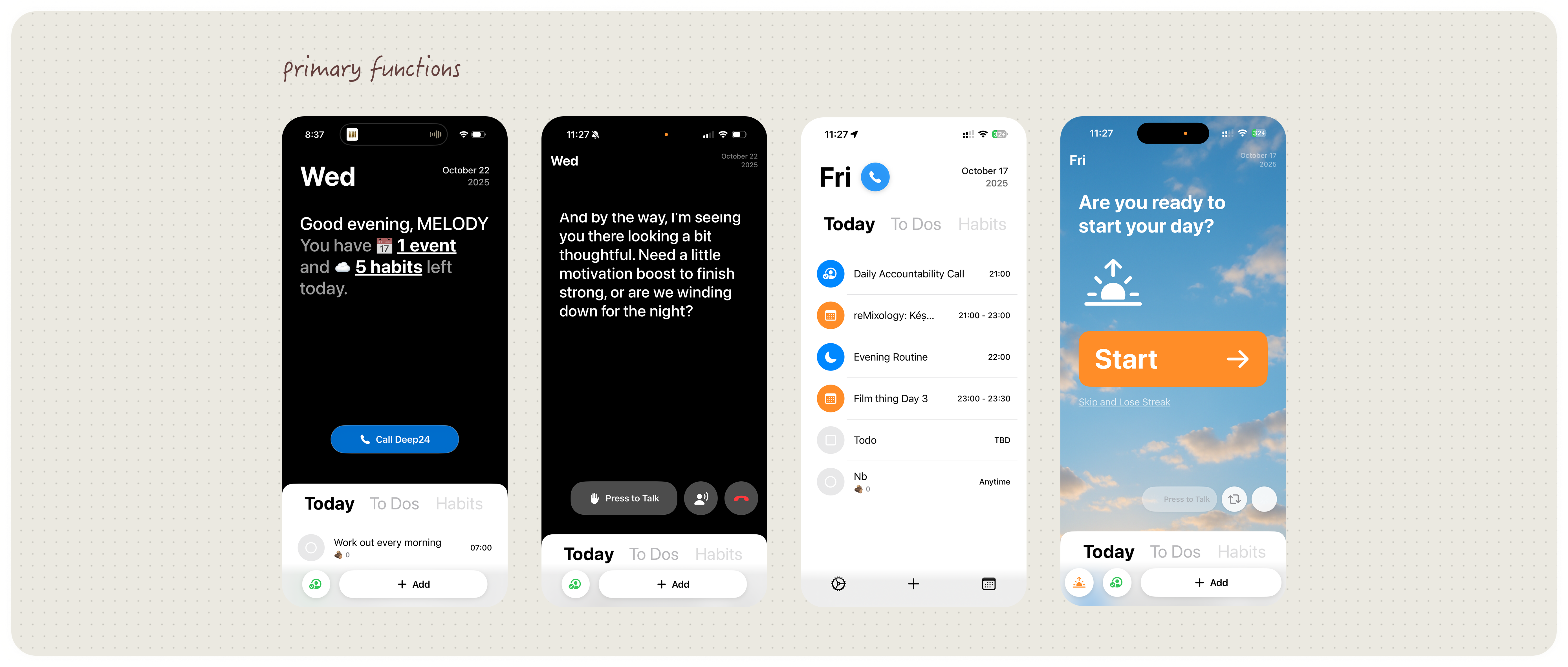
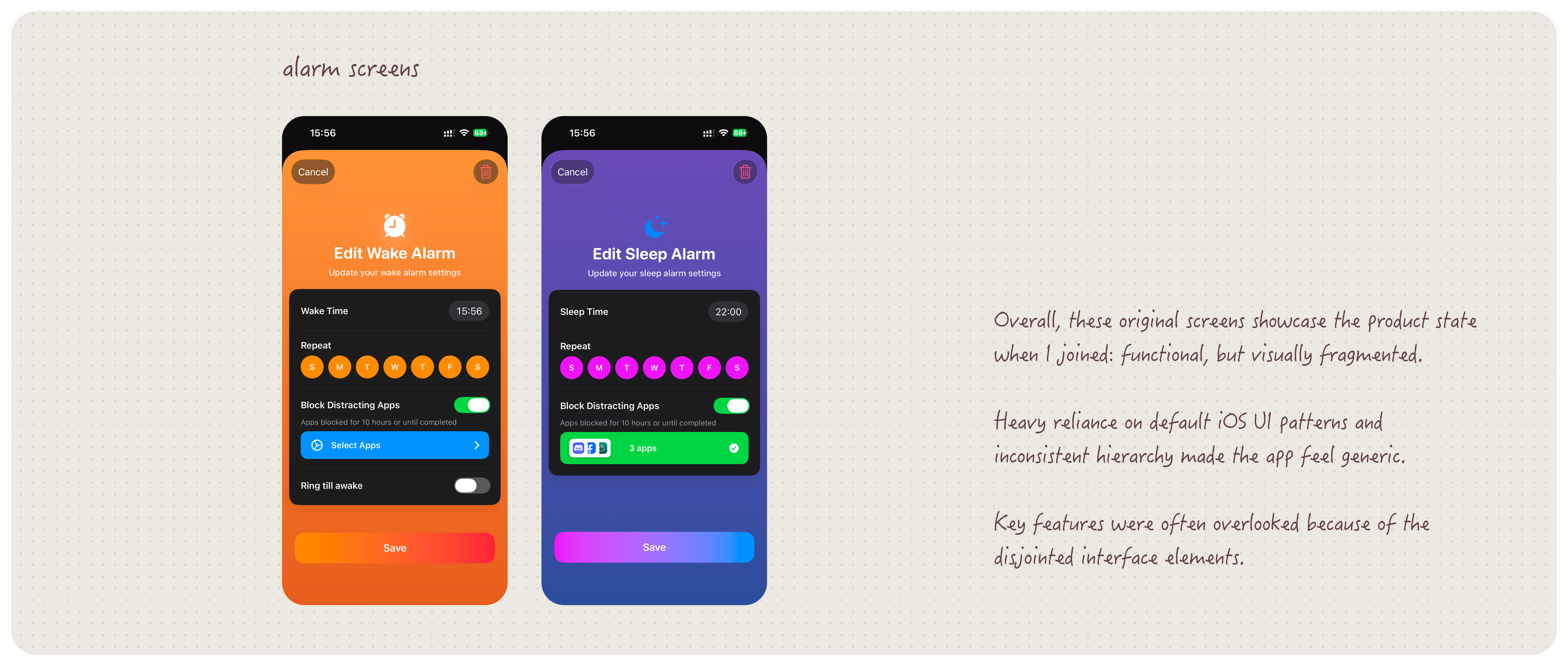
The MARKET AUDIT
Rather than a single research sprint, Deep24 required continuous landscape scanning as new features were proposed. I audited planning, habit, and messaging apps to understand how successful products structure time, navigation, onboarding, and chat-based interactions.
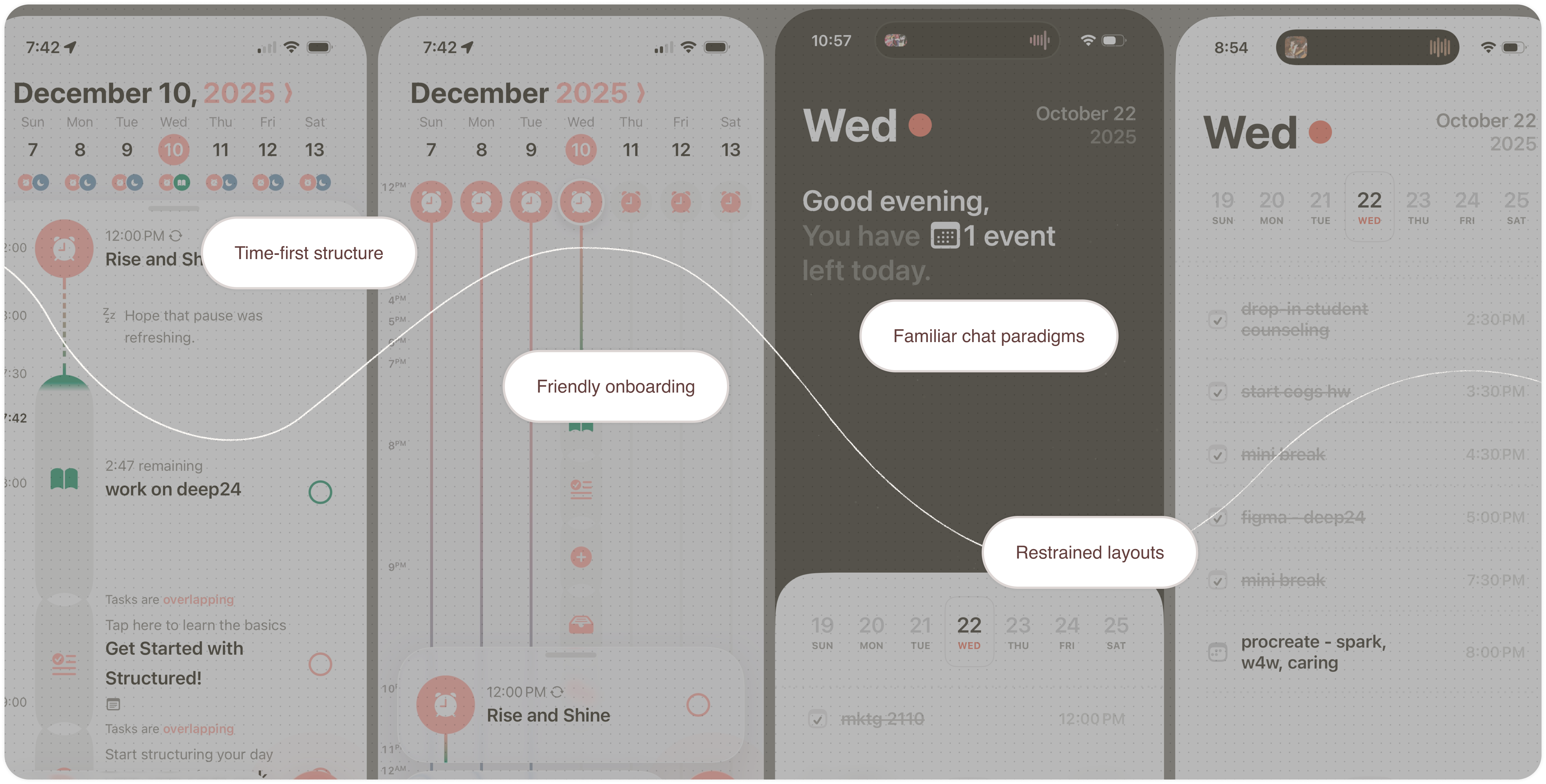
What worked across competitors:
- Calendars (e.g., Joi Planner, Habit) that embed tasks directly within time blocks made priorities immediately legible.
- Minimal interfaces (e.g., Structured, Experiments) reduced cognitive load while still feeling intentional.
- Features introduced gradually through onboarding helped users understand how to engage without overwhelm.
- Patterns borrowed from iOS Messages and Instagram DMs lowered friction and improved discoverability.
Where some competitors fell short:
- Cramped interfaces that made navigation feel stressful
- Ambiguous labels that obscured core actions
- Feature-heavy screens that competed for attention rather than guiding flow
This audit clarified which interaction patterns to adopt and which to avoid, directly informing Deep24's navigation, layout, and interaction hierarchy as the product evolved.
DESIGN*
Establishing a VISUAL SYSTEM
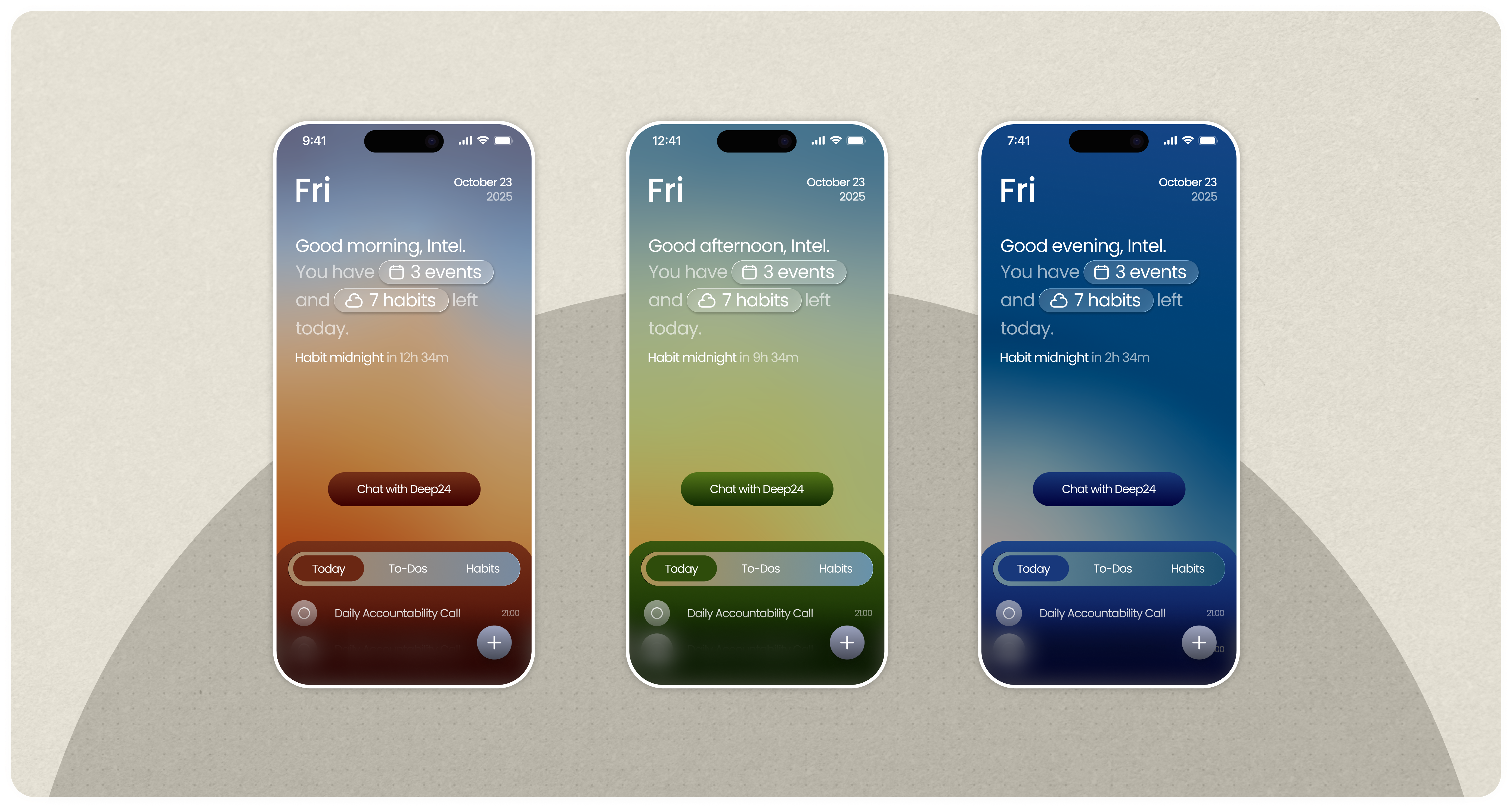
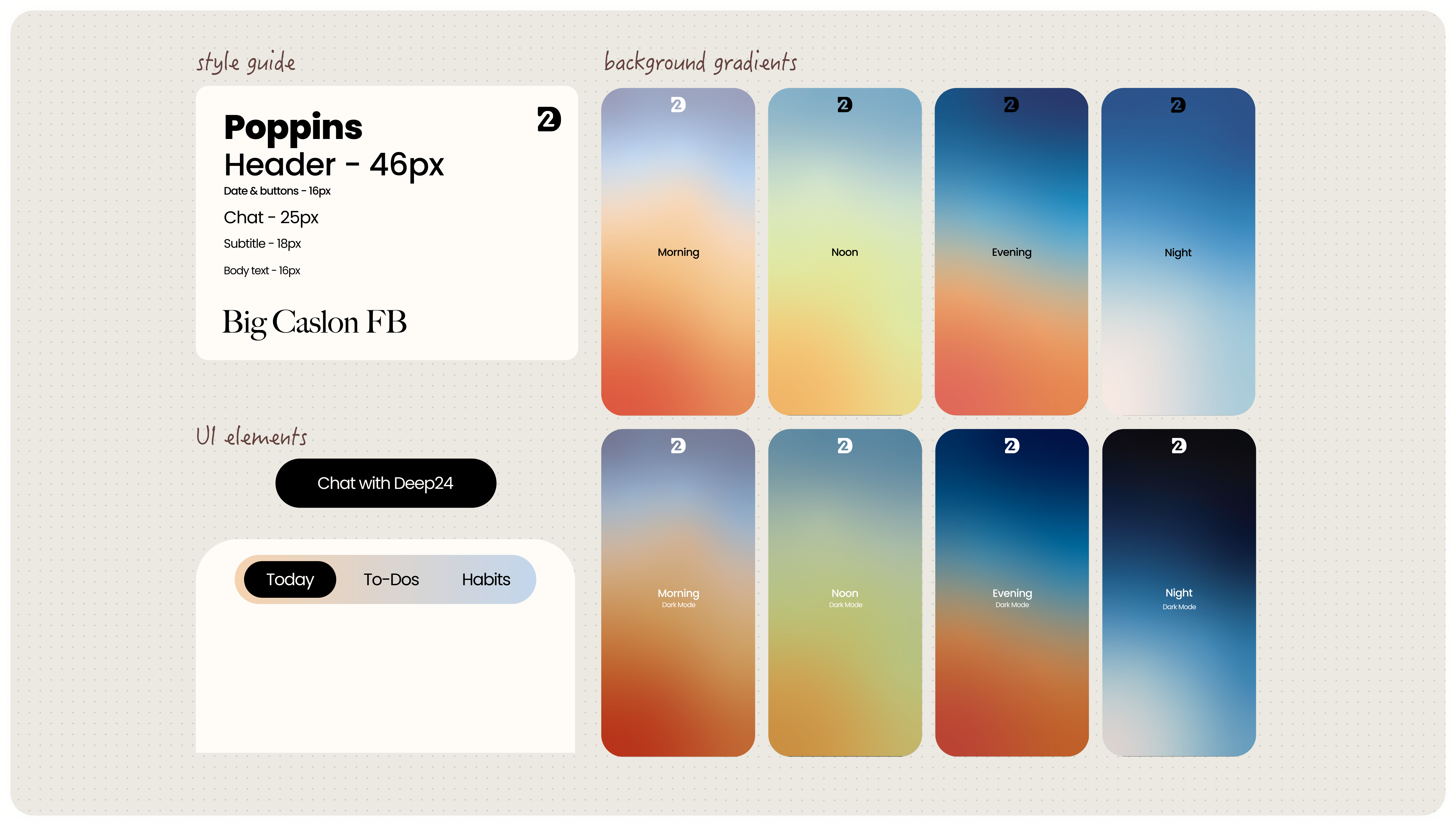
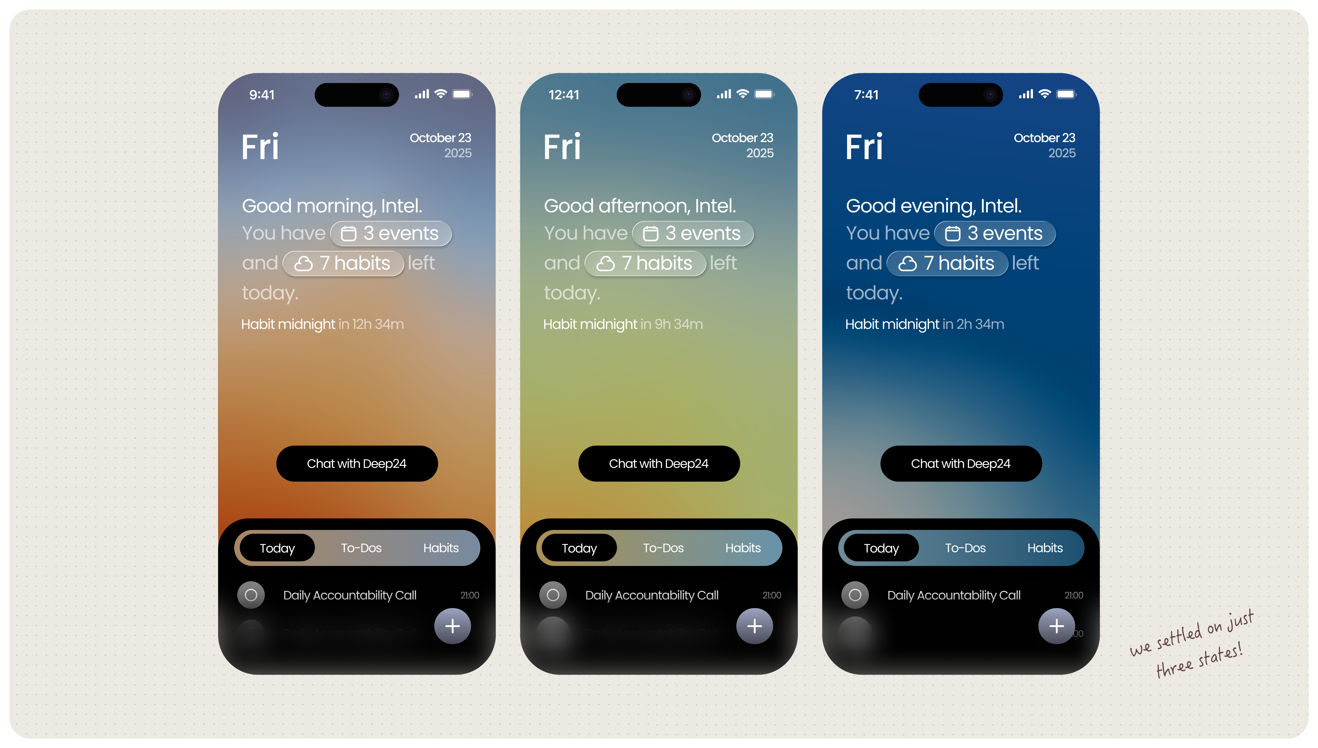
One of my earliest contributions was establishing a cohesive visual theme for the app. In response to the developers' request for more dynamism, I introduced a sky-based system in which the background gradient shifts throughout the day, anchoring the interface in time and reinforcing the app's focus on daily rhythm.
The sky served as a visual metaphor for the user's day. Mornings began with bright, energizing colors, while tones deepened over time to mirror the darkening sky and reduce visual strain. By night, the darkest gradients signaled a shift toward rest and wind-down.
The CONSTRAINTS
I initially explored a system that varied across multiple times of day and between light and dark modes, with deliberate color shifts across interface elements rather than a generic darkening.
As development progressed, engineering constraints made supporting the full range of gradients impractical. I streamlined the system by removing the evening gradient and simplifying the transition from day to night.
A later decision to commit fully to dark mode improved cohesion, though earlier light-mode explorations are included here to reflect the design process.
Restructuring UX
In parallel, I restructured core user flows and navigation patterns to make the product easier to understand and move through. By simplifying layouts, reducing redundancy, and clarifying affordances, I focused on improving wayfinding and feature discoverability—ensuring key actions were legible, intentional, and satisfying to use.
Redesigning: ONBOARDING
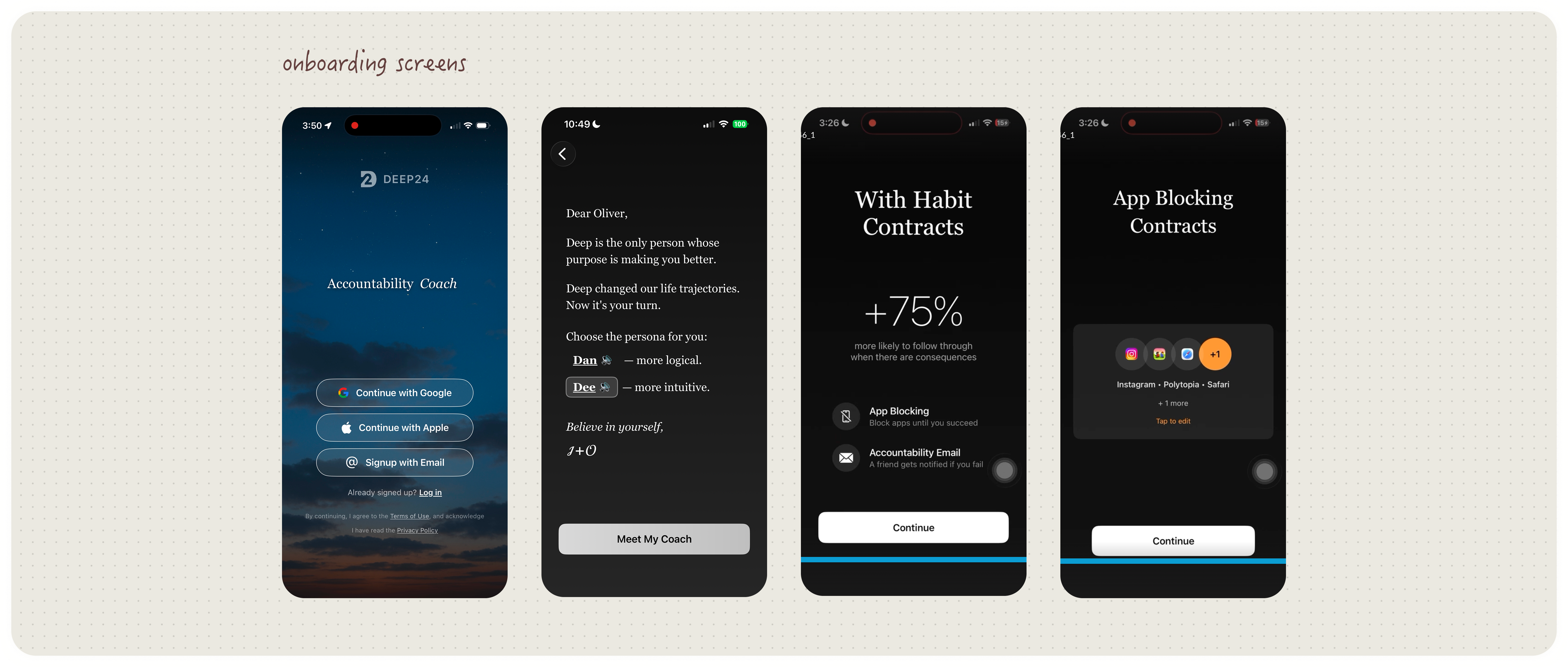
I explored two onboarding directions. The first used highly saturated colors, animated gradients, and moving elements such as stars and clouds—frequent visual variation as users moved through the flow. While conceptually cohesive, the result felt overly personalized and, as one developer put it, "too sparkly." The new visuals made the experience less universal and harder to parse at a glance.
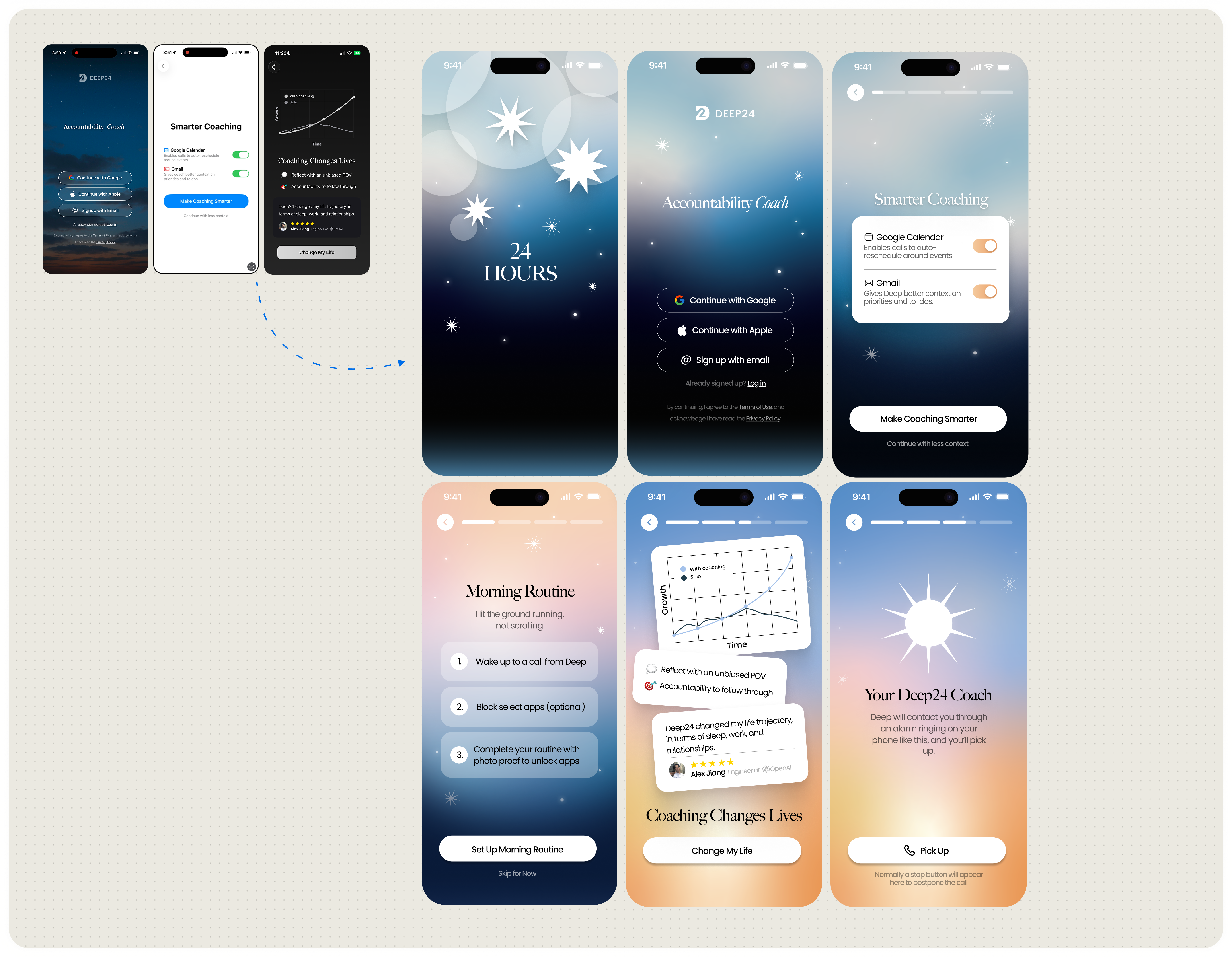
During this phase, I also experimented with early mascot concepts. Given the sky motif, I explored an emotive star character, but team feedback indicated it felt overly cutesy and misaligned with the product's intended tone. This prompted broader discussions around what kind of mascot—if any—would best represent the app.
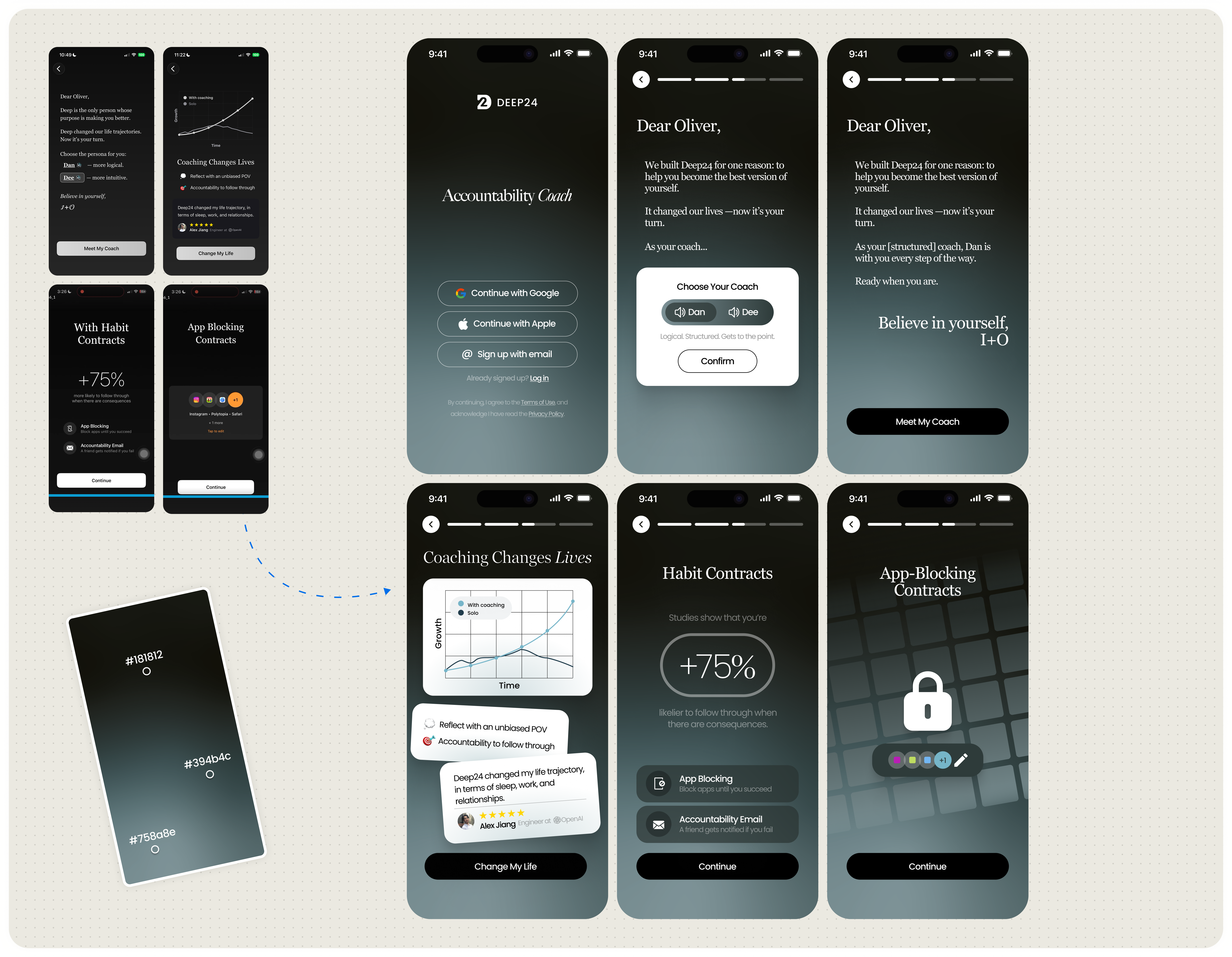
For the second iteration, I intentionally restrained the visual language. Drawing from Greydients by Nuevo.Tokyo (previously shared by the development team), I selected a cool slate gradient that emphasized clarity, professionalism, and focus. This pared-back approach significantly improved legibility and tone, and was strongly preferred by the developers as a more scalable and product-appropriate onboarding experience.
Designing: CHAT
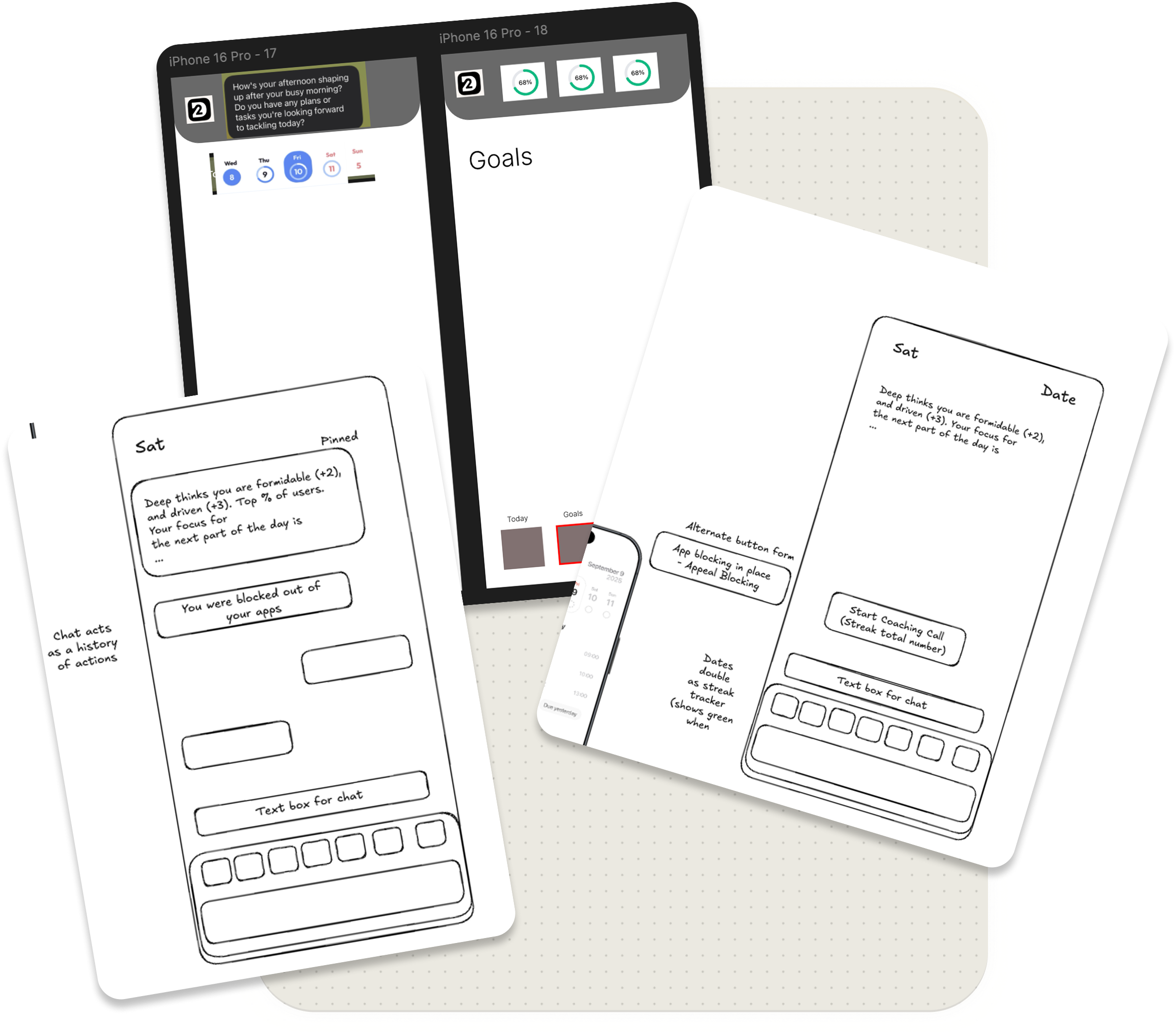
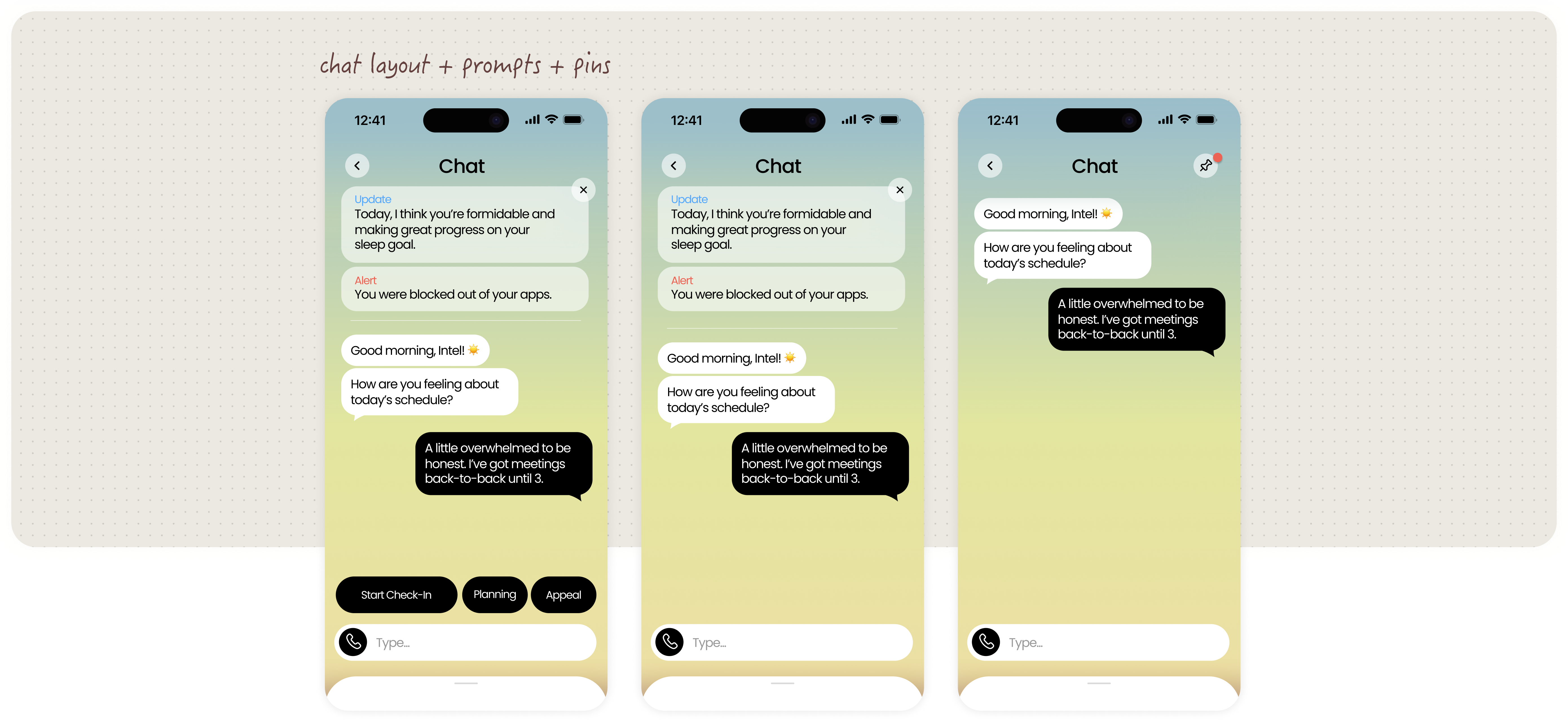
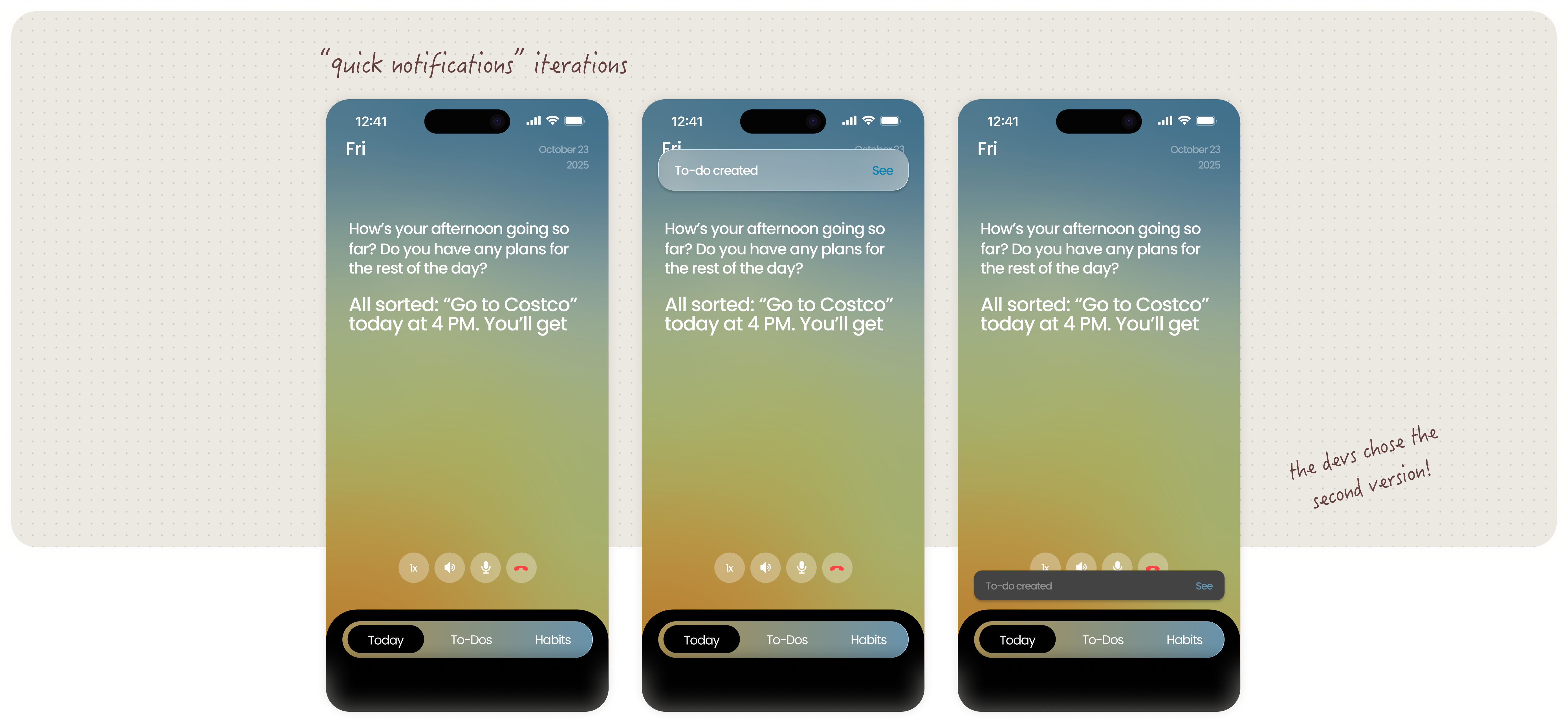
As development progressed, I began designing new key parts—namely the chat interface.
The development team provided me rough sketches of the features they wanted me to incorporate.
It was my job to translate these into interactive screens that fit into the visual ecosystem I had already created.
PIVOT*
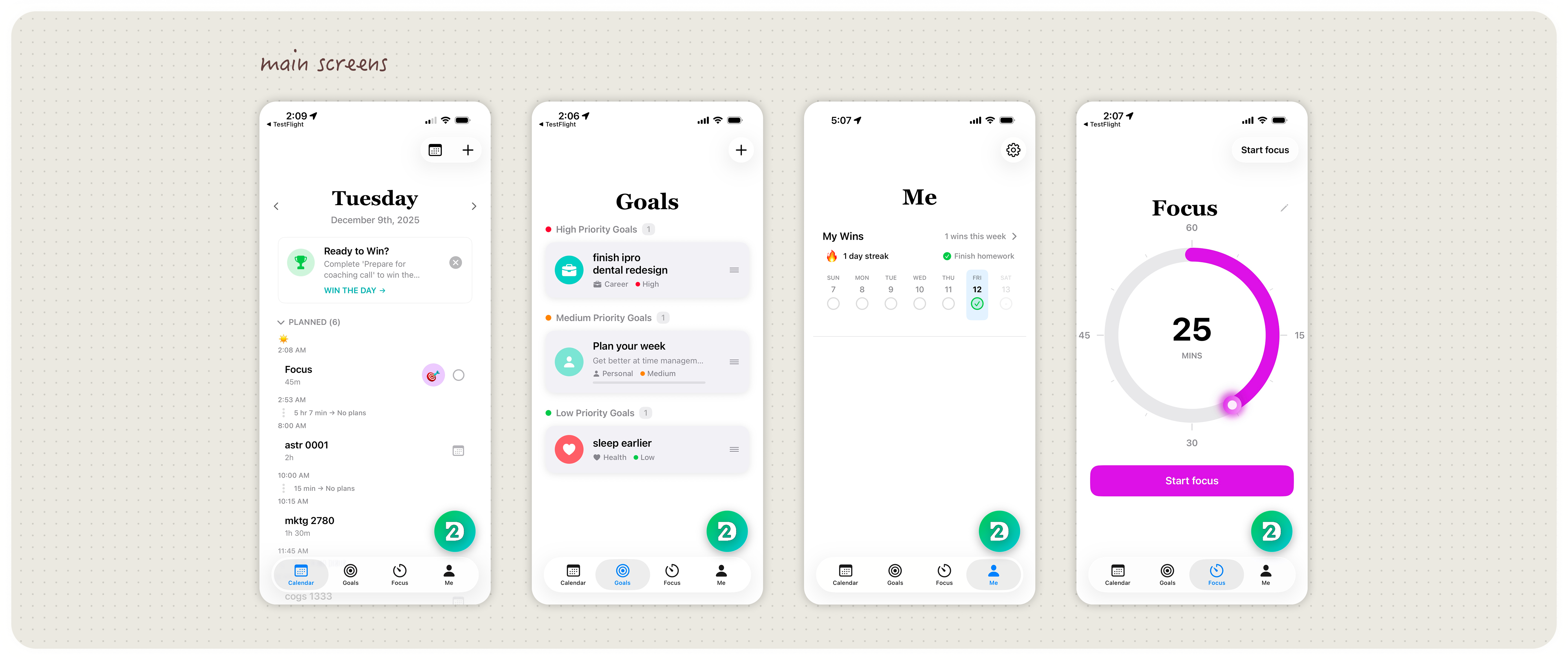
The NEW INTERFACE
Midway through development, the engineering team pivoted the product direction and presented four entirely new home screen concepts. This shift required a full visual overhaul and the development of a new design direction.
Dilemma: CHAT BUTTON
One major UX issue involved the chat button, which served as the user's direct access to Deep24's accountability coach. Because the chat interaction was central to the product, it needed to be immediately recognizable and easy to access.
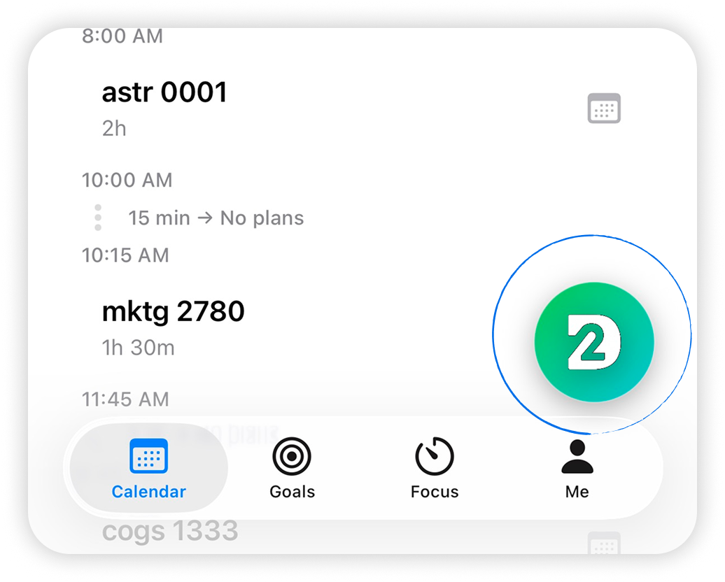

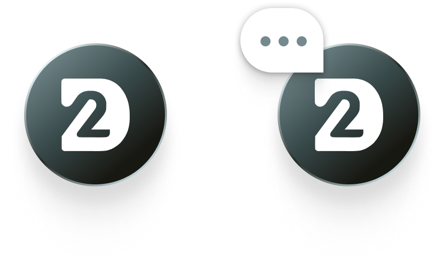
In the original interface, the button sat above and slightly detached from the navigation bar. To make it stand out, it was styled with heavy gradients and shadows to make it stand out.
In actuality, these effects actually caused it to blend into the surrounding interface, making the primary interaction harder to notice. The call-to-action button's purpose was also ambiguous. It simply didn't look like a chat button.
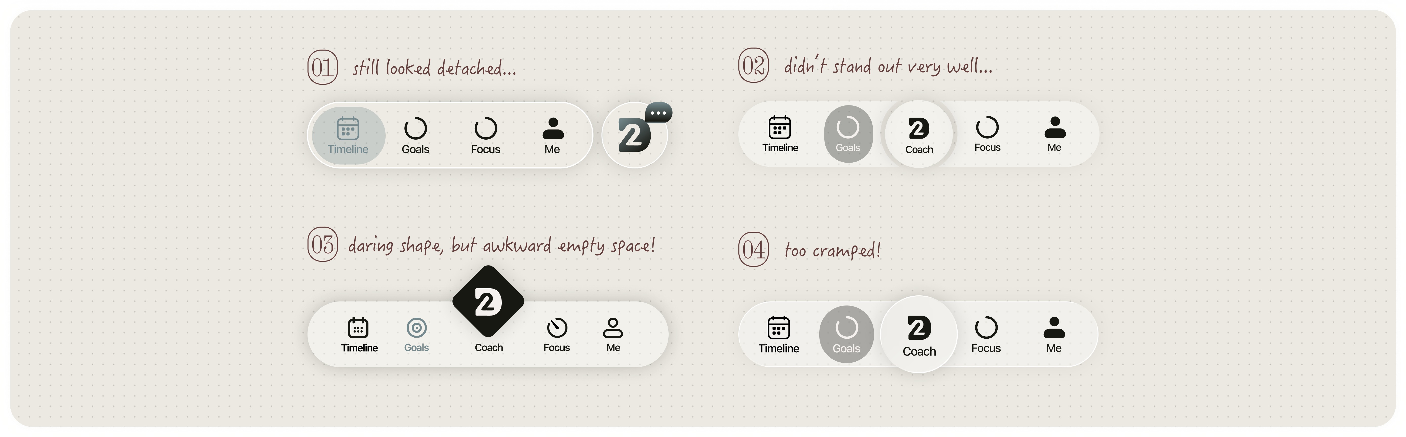
My first instinct was to experiment with stronger visual emphasis—darkening the button and testing additional visual cues to make it scream "This is the chat!"
However, these iterations either clashed with the interface or added unnecessary complexity without clarifying the interaction. I realized that the problem wasn't simply visual styling. Instead, the issue was structural:
If chat was the app's central interaction, it should live within the primary navigation system.
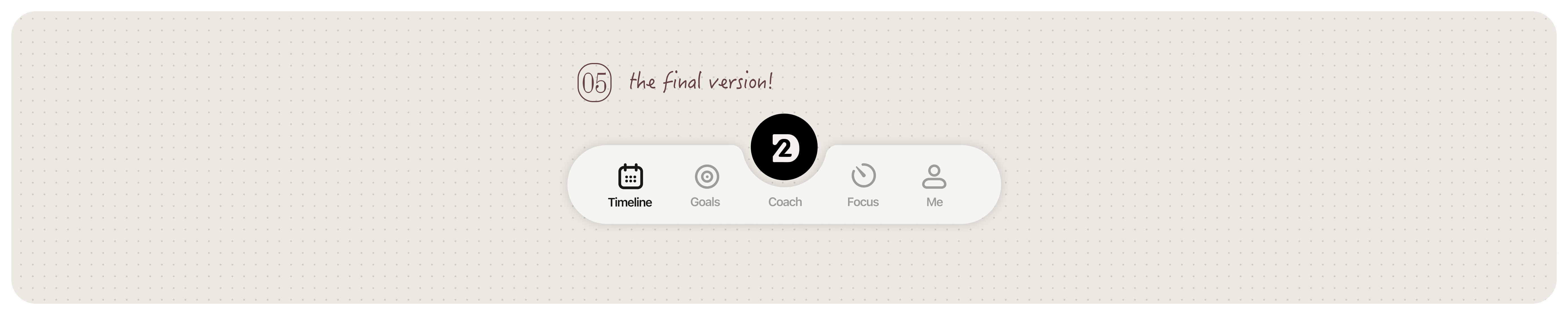
After exploring several layouts, I integrated the chat button directly into the center of the navigation bar using a subtle "cut-out" and floating treatment. This preserved visual hierarchy while reinforcing the chat interaction as the central hub of the product.
Redesign: MAIN SCREENS
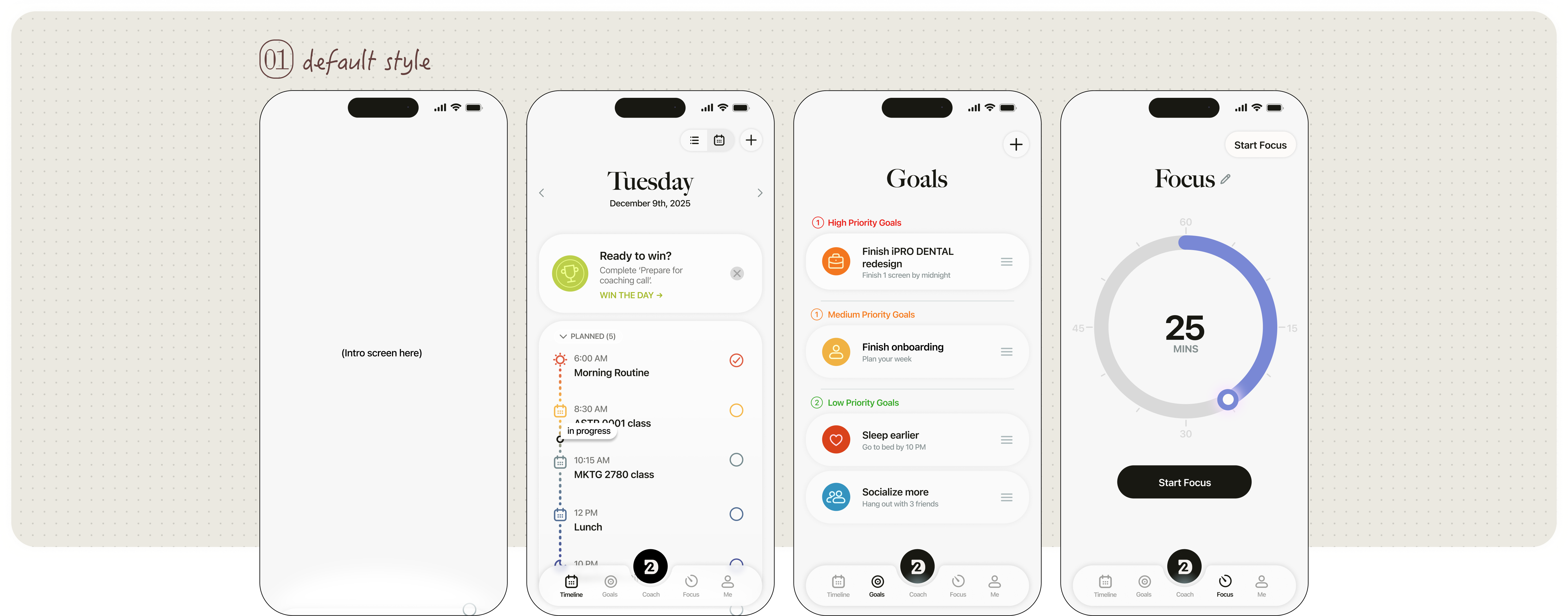
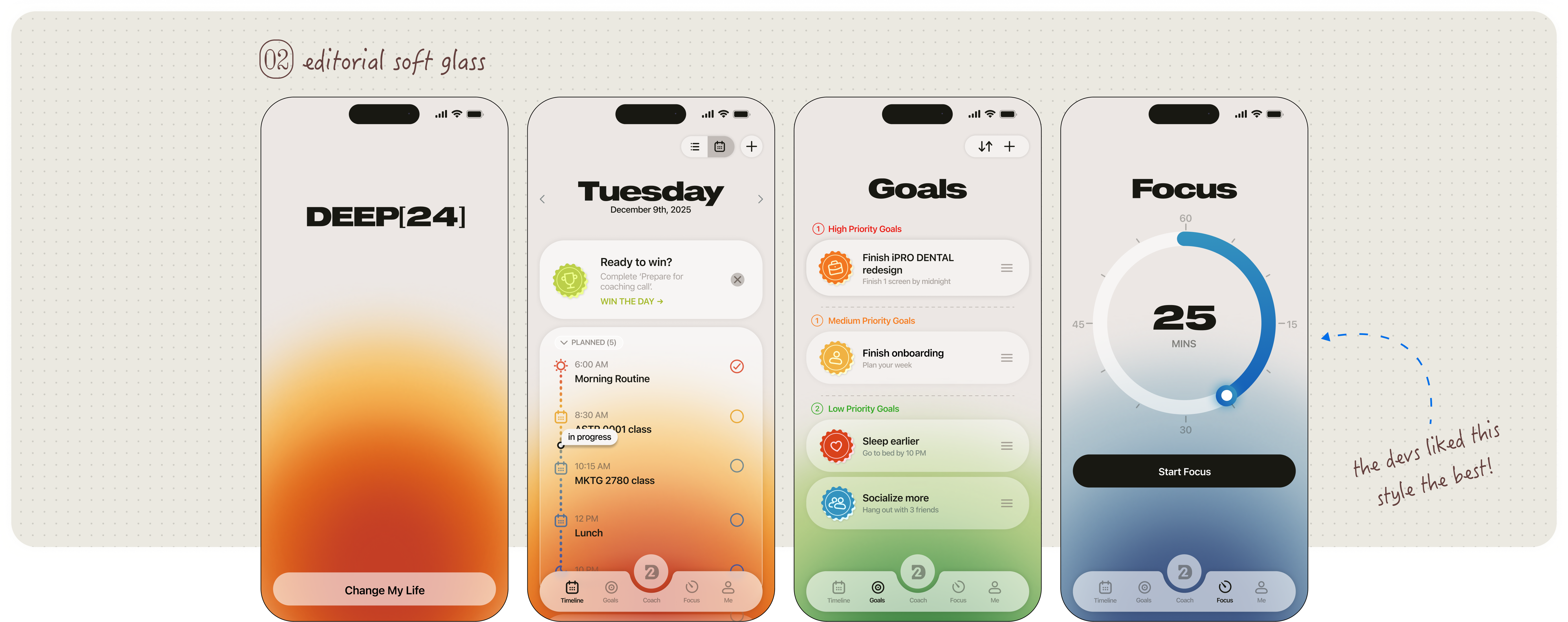
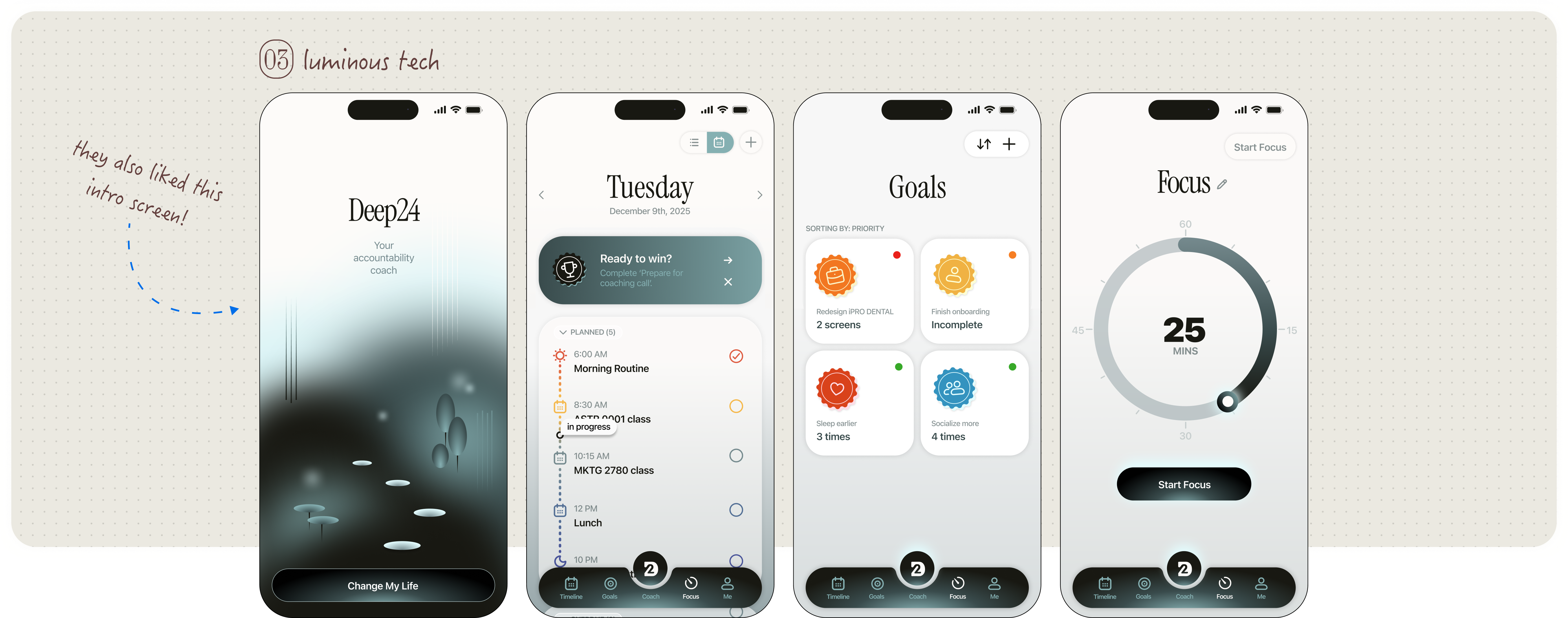
As for the main screens, I explored and delivered three distinct visual styles for consideration, each balancing clarity, warmth, and scalability.
REFLECTION*
The RESULTS
Designing for Deep24 taught me how early visual decisions compound over time in a living product. Working alongside active development sharpened my ability to prioritize flexibility, anticipate future expansion, and design systems rather than isolated screens. The project reinforced my interest in product stewardship—shaping not just how an interface looks, but how it evolves.